How I teach osmosis (without PowerPoint)
- Christian Moore Anderson

- Oct 28, 2023
- 3 min read
Updated: Jun 29, 2025
Soaking potato blocks in solutions of varying solute concentration can give visually distinct results. Students can literally see the difference.
But there are two subsequent difficulties:
Understanding a graph of the results of these changes, and
Understanding why osmosis leads to a new dynamic equilibrium.
This is a post about resolving these problems with a class of 16-year-olds using diagrams and dialogue, culminating in a stock and flow model.
Here is a sketch graph of our results:
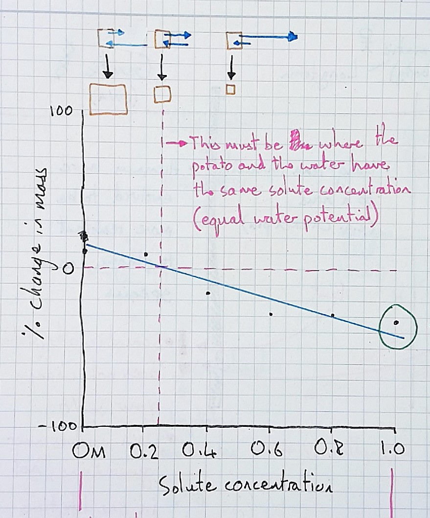
Many students have trouble interpreting this graph because they confuse it with a time graph. They see the change in mass of the potato blocks over time, and despite me making it explicit that the x-axis is different, they can't shift the idea from their mind. They need to perceive the difference, and make the distinction themselves.
As such, I always juxtapose the graph with a time graph, that is with the same y-axis (percentage change) but a different x-axis. The time scale, I tell them, is between the two points that they were weighed (i.e before being soaked, and after 24 hours).
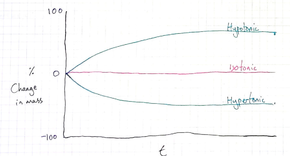
Typically my students two types of lines, ones that consist of straight lines (not curved), and ones that are curved (like above). But neither type of student, in my experience, can explain why they have drawn what they have. It always seems that those students that draw curves like mine have just become accustomed to seeing this pattern in graphs and come to expect, without knowing the mechanism.
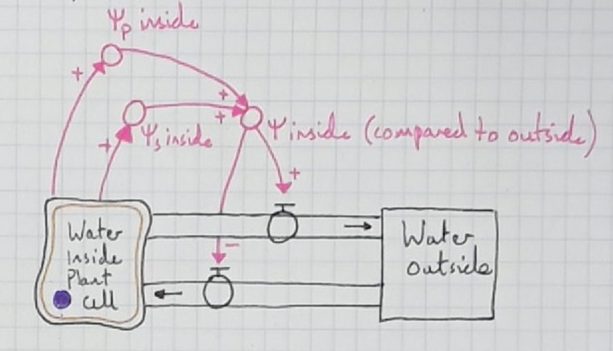
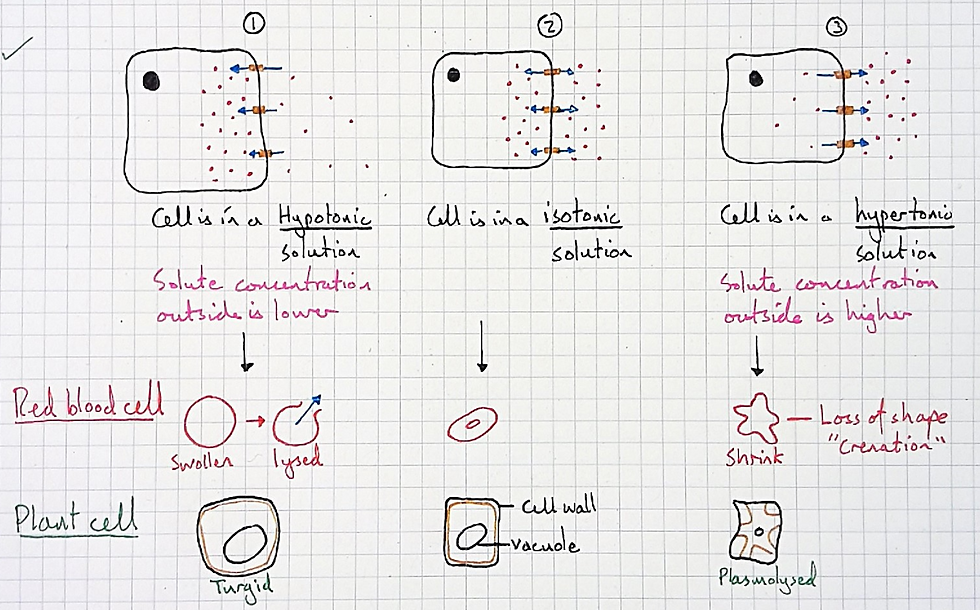
And so here I need a stock and flow model to help them. In my case, I wanted a model that conveyed the meaning of the curves in the graph above, which is the same as understanding why osmosis leads to a dynamic equilibrium. This came after the usual models taught for osmosis, shown below:
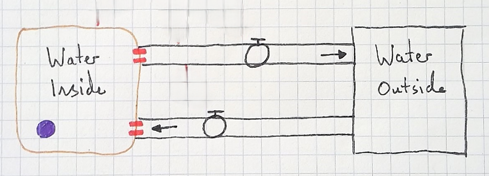
For the stock and flow model, I began as always, with just stocks and flows. I changed the stock to resemble a cell and added aquaporins to make it more visually concrete.
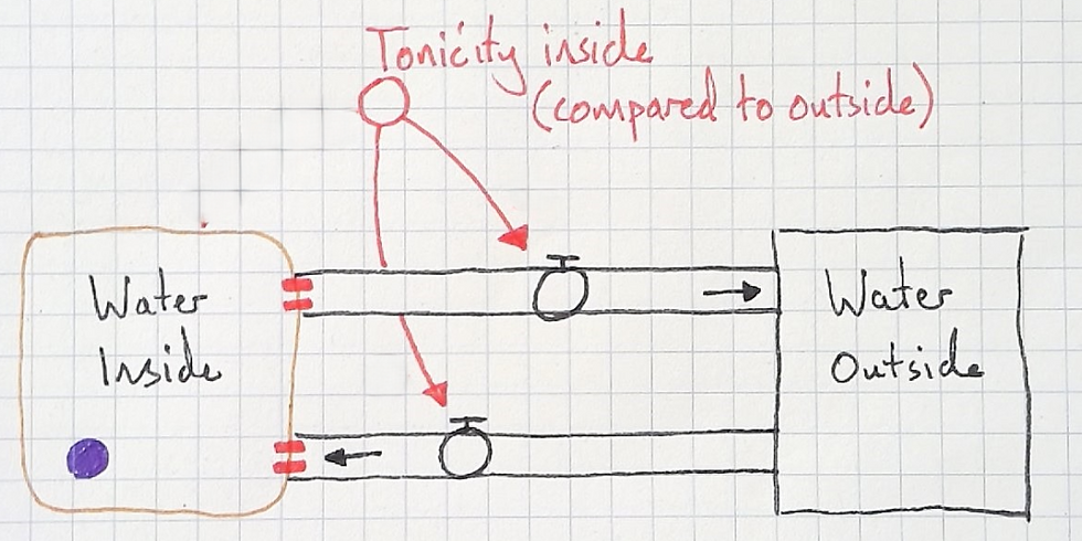
Next, I asked the students what would cause water to move by osmosis out of the cell. They replied that a hypertonic solution would cause this. I added the variable "tonicity inside" with the qualifer (compared to outside).
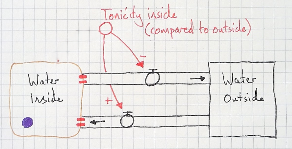
I asked my students if the connections were same or opposite:
Same: More X, more Y; or less X, less Y.
Opposite: More X, less Y; or less X, more Y.
The agreed that the higher the tonicity inside (higher solute concentration), the more the water will flow in. An "opposite" (-) relationship.
They also agreed that the lower the tonicity inside (the lower the solute concentration), the more the water will flow out. A "same" (+) relationship.
So far, this model is quite intuitive if students have already learnt about osmosis with conventional diagrams (like mine shown above). But it doesn't explain how cells arrive at a new dynamic equilibrium. I needed students to see its limitations, so we traced the water with our fingers. I told them that a cell had been placed in a hypotonic solution and asked what would happen. We traced the water as it flowed into the cell but the model doesn't indicate why it would ever stop.
If this were the case we'd always get lysed redblood cells when placed in hypotonic solutions. But this isn't the case, they may lyse, but they may also become swollen without lysing.
Having discussed this, the students felt a need to another connection that would satisfice:
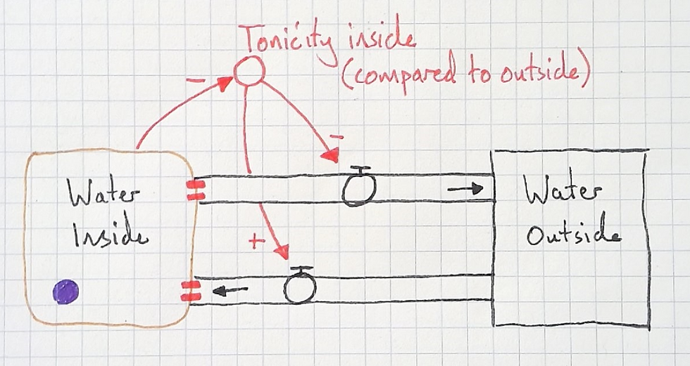
Then, I had my students trace the water with their fingers (as I teach with a document camera, they can see me tracing the water with my fingers too). We traced water flowing into the cell and as it did so noted that it was filling with water. This causes the tonicity to decrease (lower solute concentration) and water starts to flow back out again with more force. This slows down the inflow, until, bit by bit, the cell becomes so full of water an equilibrium of tonicity causes the outflow rate to match the inflow rate. A new dynamic equilibrium is reached.
As my students and I work through the model in dialogue students begin to think about the two flows simultaneously. This allows them to make meaning of reaching a dynamic equilibrium, and make meaning of the the curve of the osmosis time graph above.
After perceiving these differences and making the distinctions, its time to return to the original graph of percentage change in mass versus solute concentration. And, in my experience, students now understand it much better and we can discuss how we can use it to estimate the concentration of solutes in the potato and other vegetables. Learn how to teach this way in Difference Maker. Download the first chapters of each book here.