How I teach oxygen dissociation curves
- Christian Moore Anderson

- Dec 5, 2024
- 1 min read
Updated: Mar 3
Oxygen dissociation curves are difficult for students. I often find that difficulty comes from trying to visualise the mechanism through a graph. In this post, I'll show you how I've built a model of the system with a class, which we cna then translate into a graph.
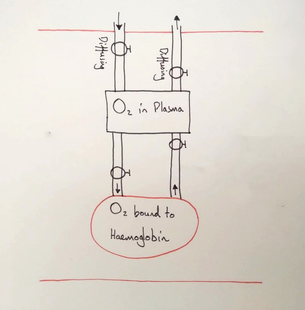
Firstly, I began with two stocks and their flows. I labelled the stocks, situated them in a capillary (note the two red lines) and asked the students what the flows represented. They agreed that the first flows represented diffusion. The next two are deducible from the names of the stocks: binding and unbinding (I forgot to write the names on this diagram).
🚨 Update: I've moved to a new home! You can read the newest, updated version of this article on my new website here: https://christianmooreanderson.com/how-i-teach-oxygen-dissociation-curves/


